WEB / IDENTITY / AI / ADVERTISING
Unsound Festival
Music festivals rarely compete on sound alone. They compete on atmosphere, identity, and the culture formed around the experience. Without a distinct visual system, even the most experimental lineup risks dissolving into the noise. For Unsound Festival, SIGNA developed an identity built to behave like the music it represents. Typography, motion, and composition were structured to shift and evolve across formats, creating a visual language capable of carrying the same intensity and unpredictability as the performances themselves.
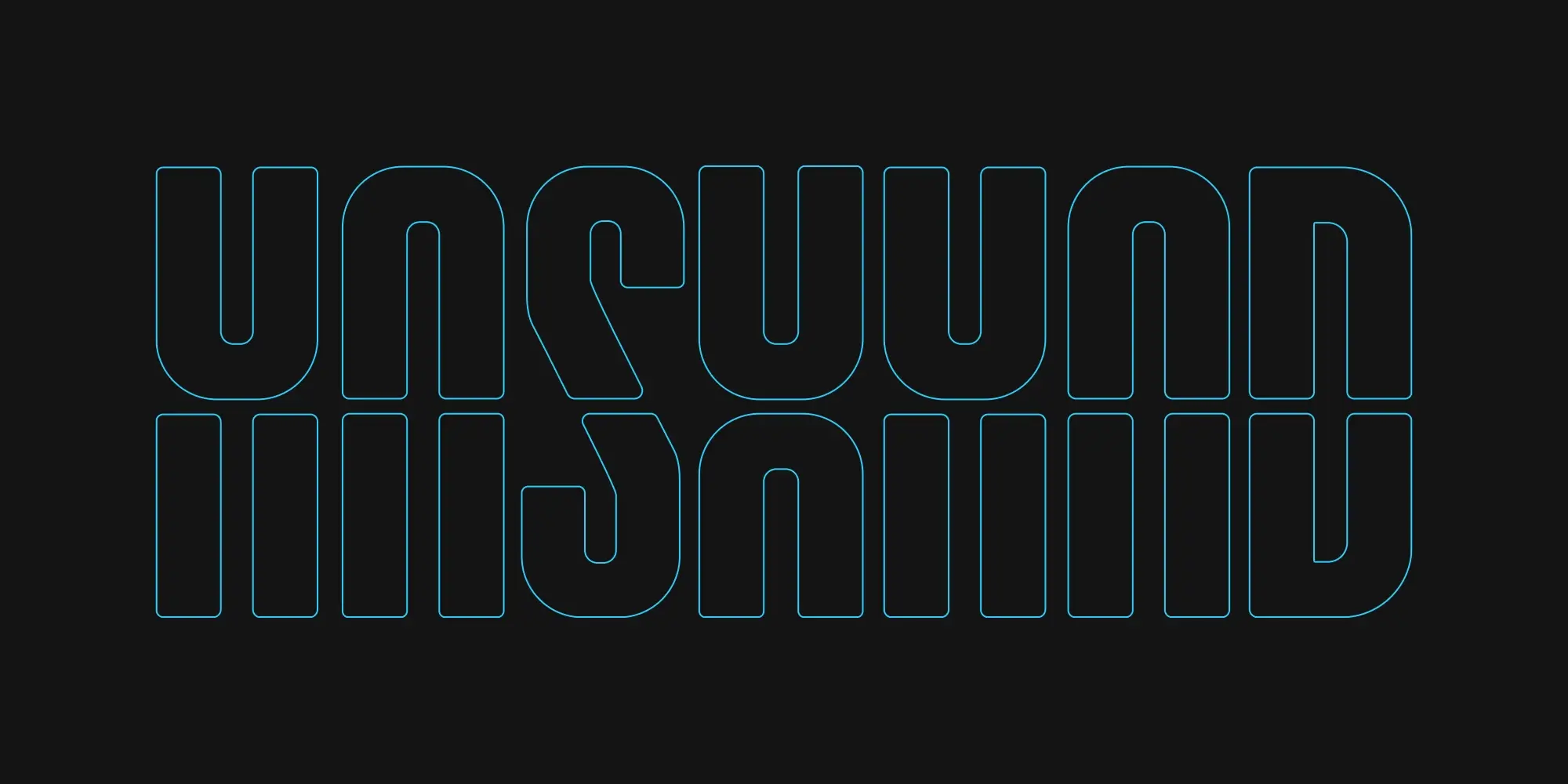
Sound was never enough. We dismantled the existing identity and rewrote it in motion. The letters roll, fold, and distort, as if the festival’s name itself were alive, breathing, glitching.
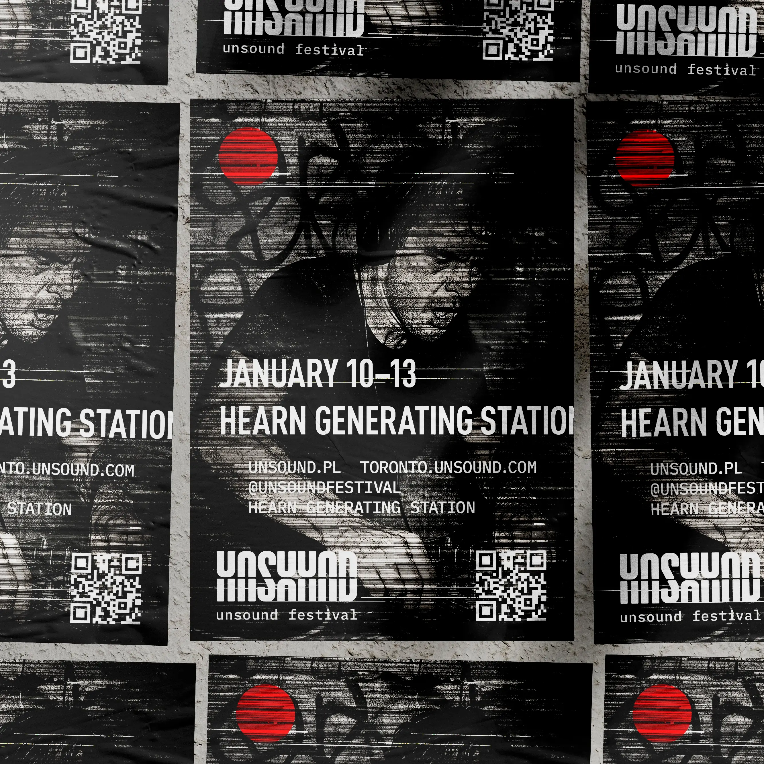
Each poster became distortion made tangible. We leaned into Berlin’s industrial echo and raw atmosphere. The power station hums. The sub-bass pulses in the bones. The logo slides, fractures, and reassembles. The viewer becomes part of it. You feel the distortion before you hear the sound.