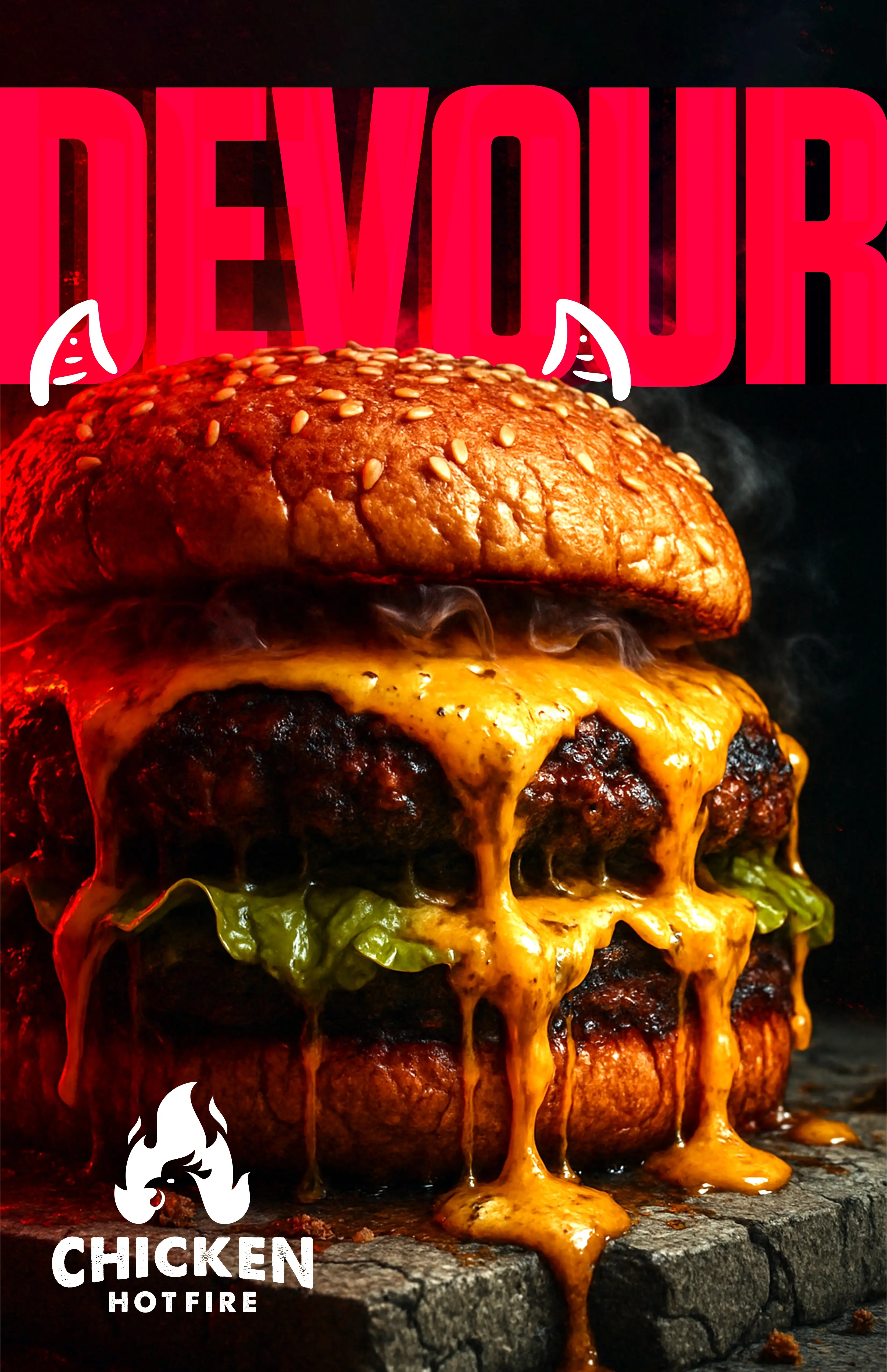
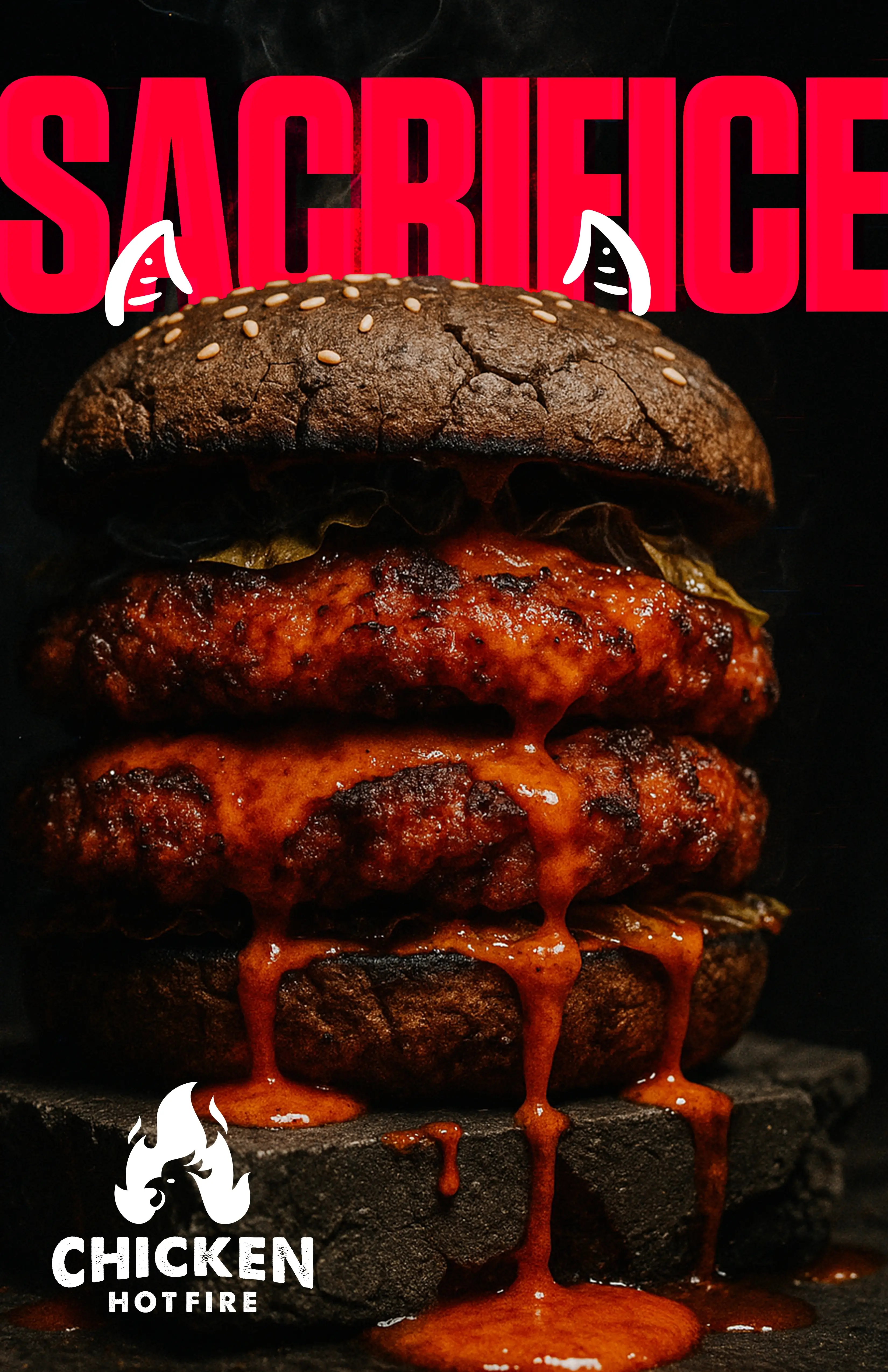
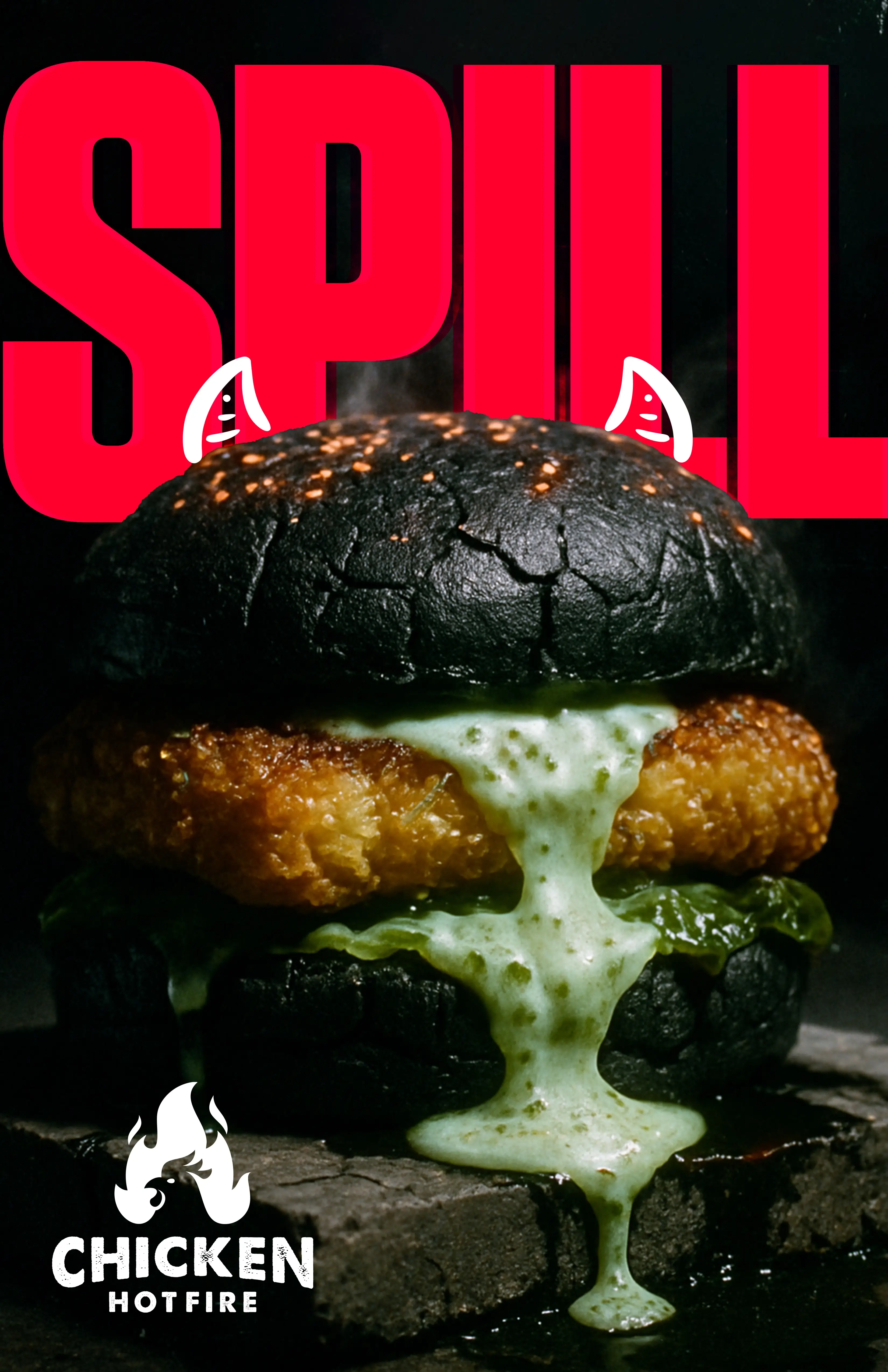
Chicken Hotfire’s audience does not count calories. They prioritize flavor. That is what we built, unapologetically.
If indulgence is a sin for those fighting desire, we made it a delicious one. In a market obsessed with oat milk, macros, and virtue signaling, we created a campaign that said: forget moderation. The colors were hellfire red. The textures biblical. Each ad dared the audience to admit it: purity is boring.
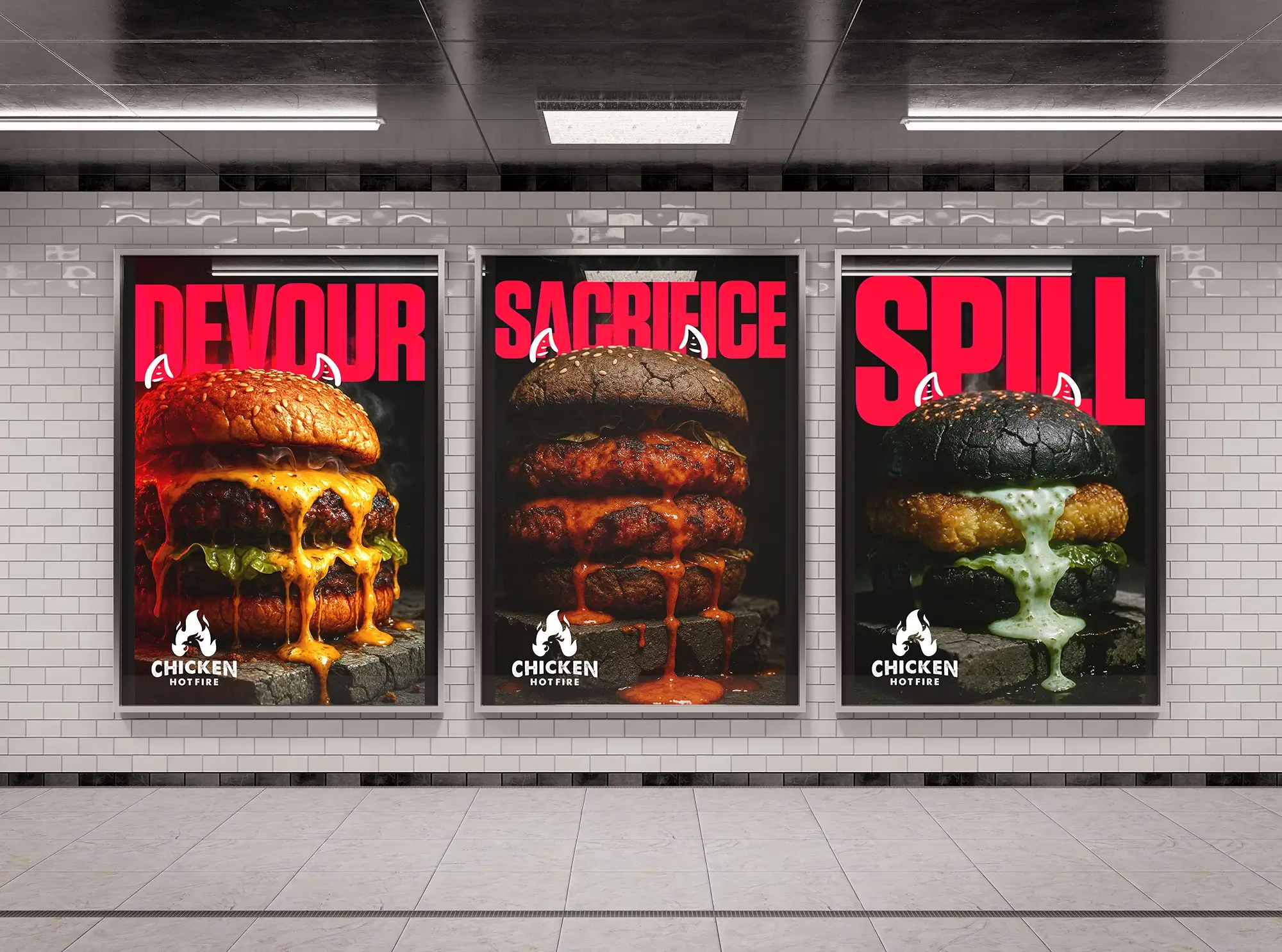
With strong visual impact and a touch of the profane, we captured attention and appetite. There is no boxed solution that applies every time. Research, observation, and creativity lead the way, helping brands realize their dreams and competitors confront their nightmares.