NULLA VENIA
Client: IRONMADE2025.09.16
The pre-workout market is saturated with clichés: lightning bolts, neon splashes, and cartoon aggression. Every brand screams the same thing louder and louder, hoping to look “hardcore.” IRONMADE wanted something different. The challenge was to create a pre-workout brand that didn’t look like an energy drink but like initiation into a warrior cult.
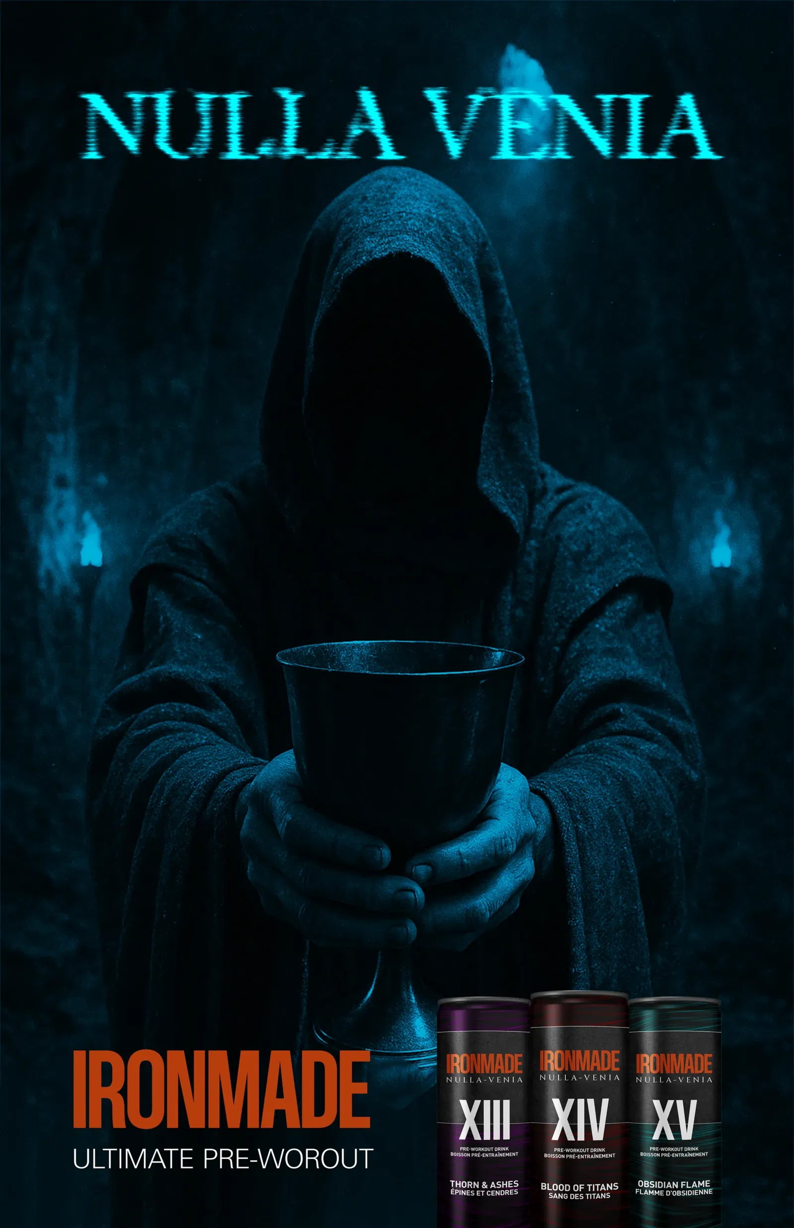
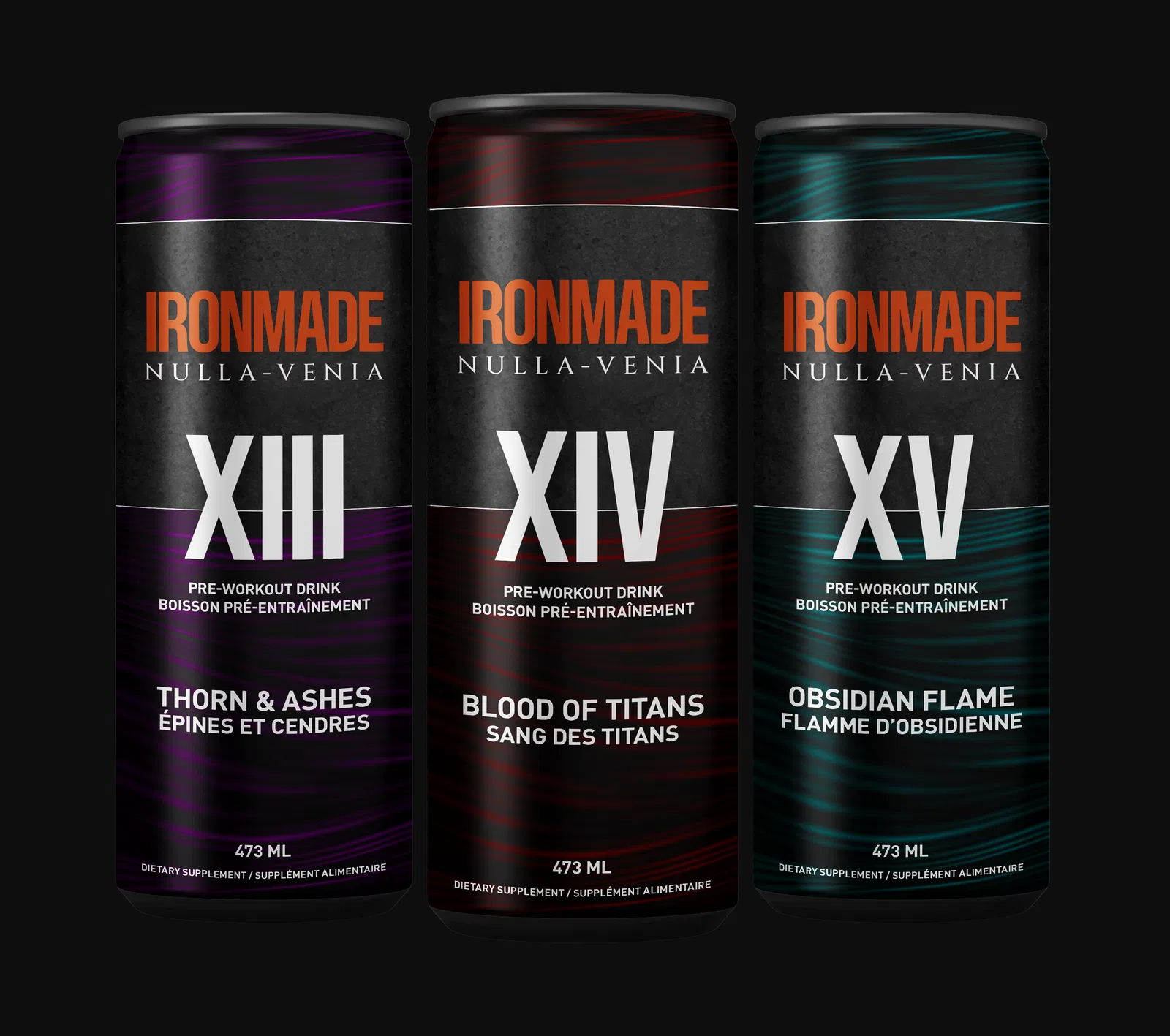
SIGNA framed IRONMADE as ritual, not routine. The brand became less about pumping iron and more about submitting to an ancient order of strength. The core signal was initiation: an unforgiving Latin tagline, Roman numerals for each formula, and flavours named like mythic trials: Thorn & Ashes, Blood of Titans, Obsidian Flame. This wasn’t a product to consume. It was a rite to endure.
The cans were designed as artifacts: matte black surfaces, metallic accents in red, purple, and obsidian green, each marked with imposing Roman numerals. Typography was bold and severe, engineered to read like scripture. The tagline Nulla Venia — “No Mercy” anchored the brand with cold finality. Campaign imagery presented IRONMADE as a chalice offered by hooded figures, a drink not marketed but bestowed. Packaging, posters, and visuals all leaned into cinematic darkness, turning the act of supplementation into an initiation ceremony.
IRONMADE cut through the noise of the supplement aisle instantly. Its identity resonated with athletes who craved more than hype; they craved belonging to something mythic. The brand created a sense of ritual around pre-workout, making every sip feel like stepping into battle.
IRONMADE didn’t sell pre-workout. It forged warriors.