
Every Scar Has a Spirit.
Client: Obsidian Tequila2025.08.31
The tequila market is a circus of neon labels, celebrity gimmicks, and hollow “premium” claims. Our client didn’t want another bottle screaming for attention. The brief was simple but brutal: create a brand that commands silence, presence, and respect. A tequila forged in darkness, crafted with precision, and impossible to ignore.
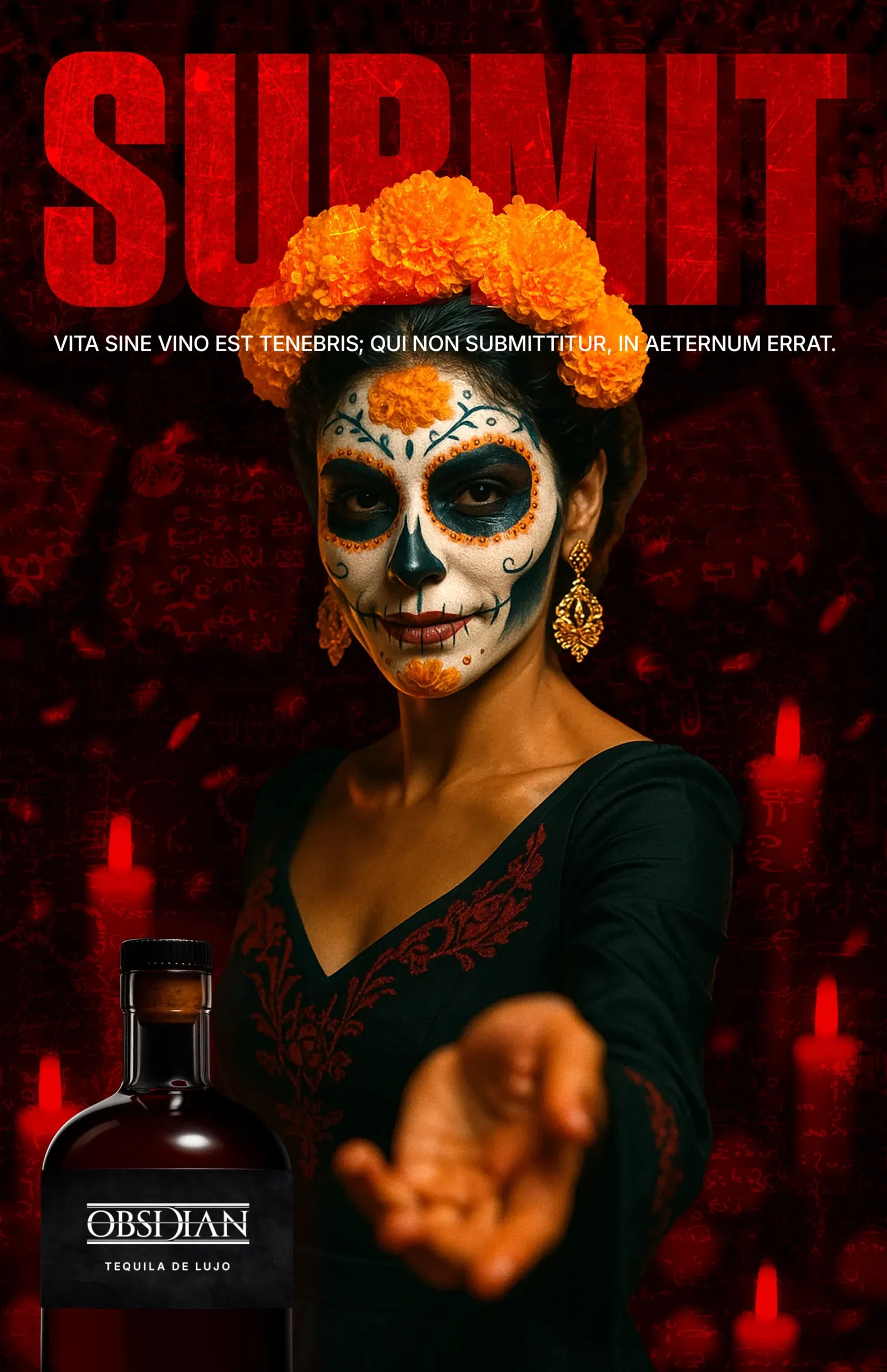
We stripped tequila of every cliché. No agave fields, no desert sunsets, no borrowed culture. Obsidian would embody power, patience, and refinement. Our mantra: “Silence over noise. Shadow over neon. Gravity over gimmick.” This wasn’t about branding a liquor. It was about creating a ritual, a discovery reserved for the few who know the difference.
Every choice was deliberate, disciplined, and stripped of excess. The bottle became a monolith: black glass, a minimal label, and typography carved like stone, an object with weight and inevitability. The identity followed the same principle: black stone and white lines, visual restraint engineered to whisper luxury while commanding attention. The narrative framed Obsidian not as another “premium tequila,” but as a spirit de lujo, forged in darkness and designed for those who demand the extraordinary. Photography sealed the vision with firelight over gloss and intimacy over spectacle, each frame crafted to feel cinematic rather than commercial. The result wasn’t decoration, it was presence, a brand that feels less designed, more discovered.
Obsidian stood apart in a sea of noise. Not through shouting, but through silence. It positioned itself as more than “premium”: a timeless, rare artifact that belongs in the hands of collectors, not casuals. Bars and tastemakers recognized its weight instantly.
Obsidian didn’t just launch a tequila. It forged a presence.